Monitoring
📈 Monitoring
Two complementary tools for keeping deployed soft sensors honest: Data Drift Detectors flag when inputs move away from the training distribution, and Model Divergence compares the deployed model with other candidates from the Registry.
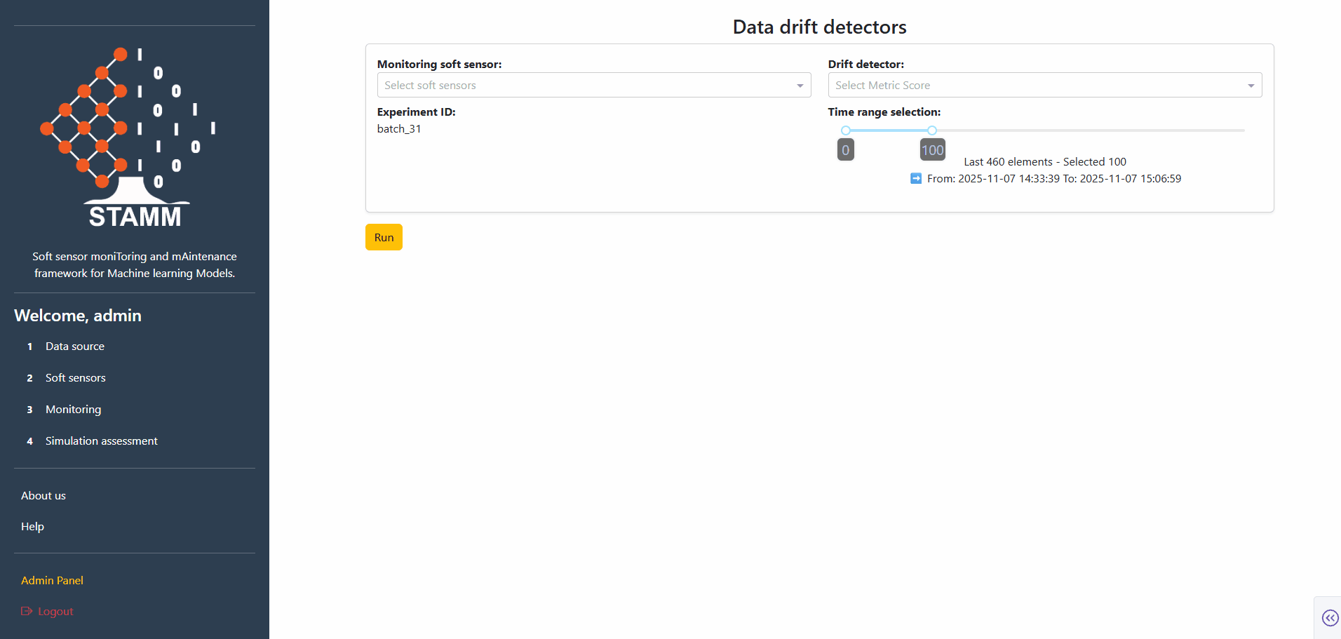
Data Drift Detectors
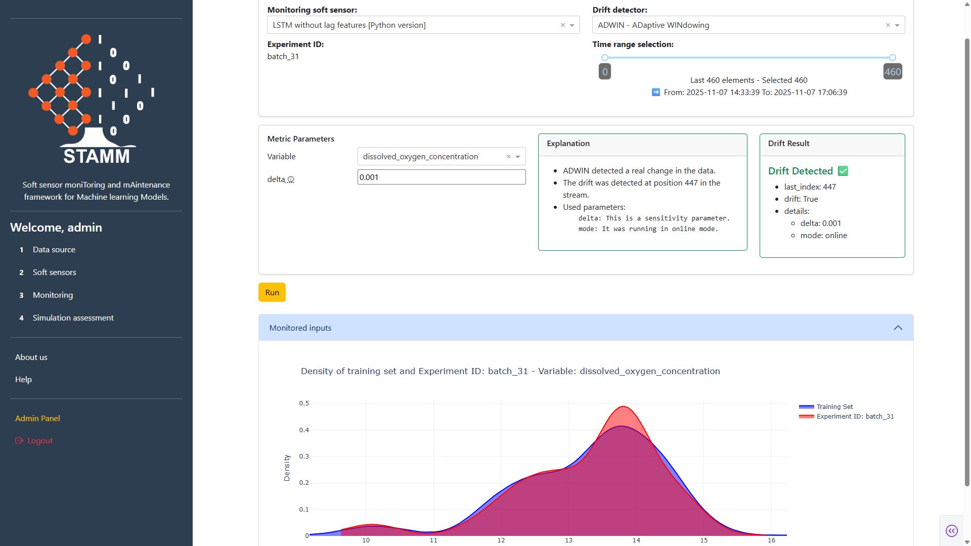
Continuously monitor a deployed soft sensor by analyzing how it behaves over the data of a chosen experiment. Pick a detector, set its parameters, and STAMM returns the drift score, a human-friendly explanation, and a train–test density plot.
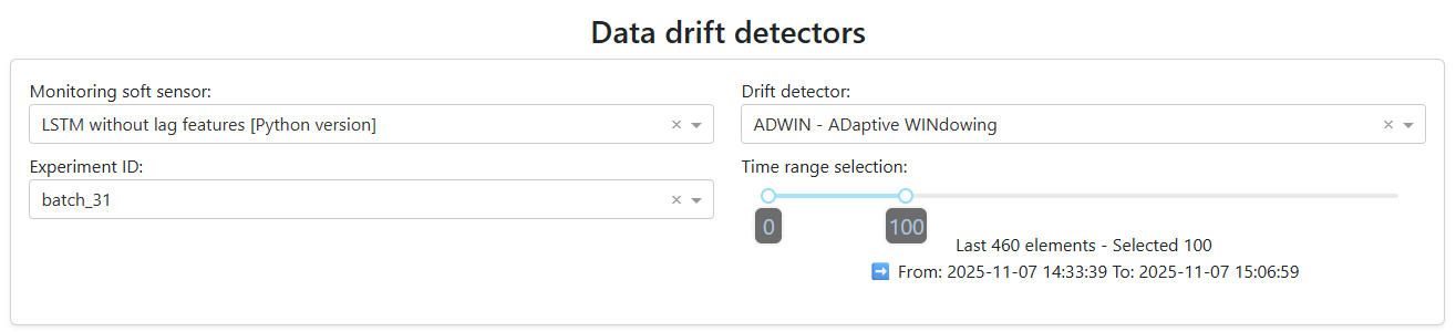
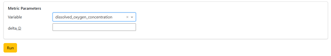
Pick model, detector, experiment, window
Choose the soft-sensor model to analyze, the drift detector to run, the experiment that feeds the data, and how much of it to use. A slider tunes the data window — defaults to the most recent 100 points.
- Active model from the Soft Sensors section
- Detector from the curated catalogue
- Experiment ID + data-window slider
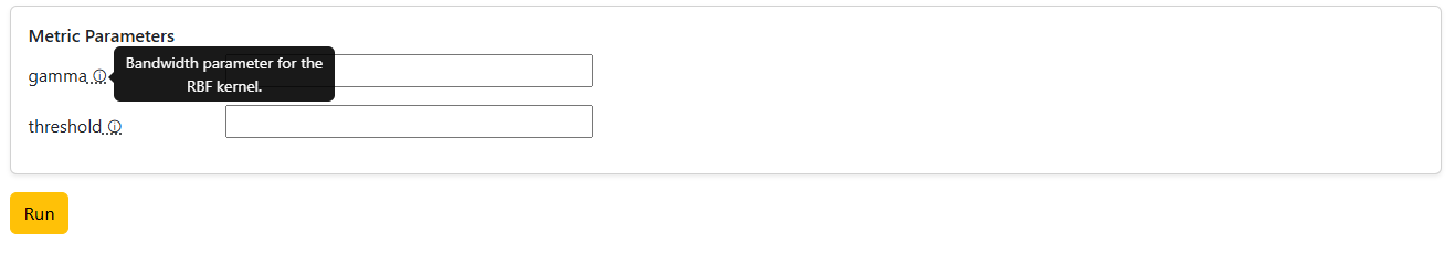
Set the metric parameters
Pick a metric and the dashboard loads its parameters automatically. Univariate metrics also surface a variable dropdown; multivariate ones go straight to parameters. Every field has a tooltip explaining what it does.
- Univariate: detector + variable + parameters
- Multivariate: detector + parameters only
- Tooltips per parameter
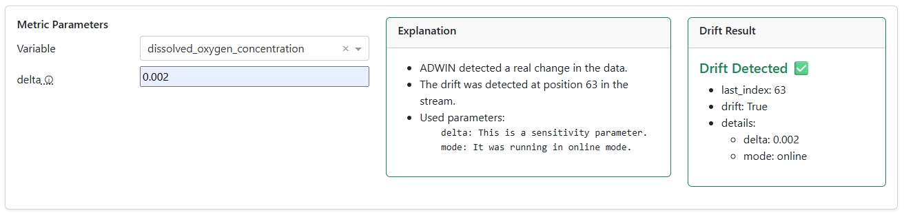
Read the result
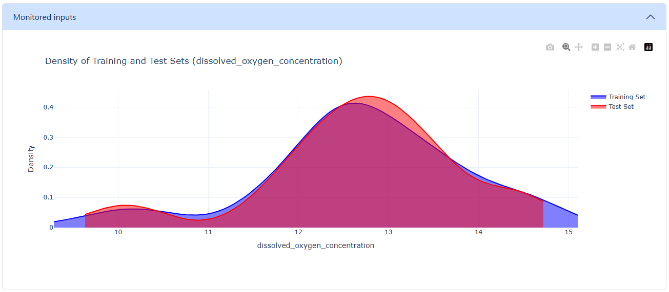
Hit Run. The panel returns a human-friendly explanation plus the raw drift result — Index (point of detection, -1 = none), Drift (True/False), and the Details dict. A density plot compares training vs. test distributions so distribution shifts become visible at a glance.
- Plain-language explanation alongside numbers
- Index · Drift · Details breakdown
- Train–test density comparison
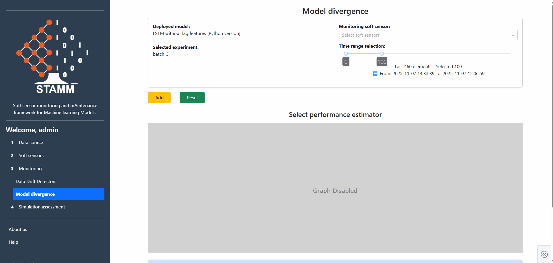
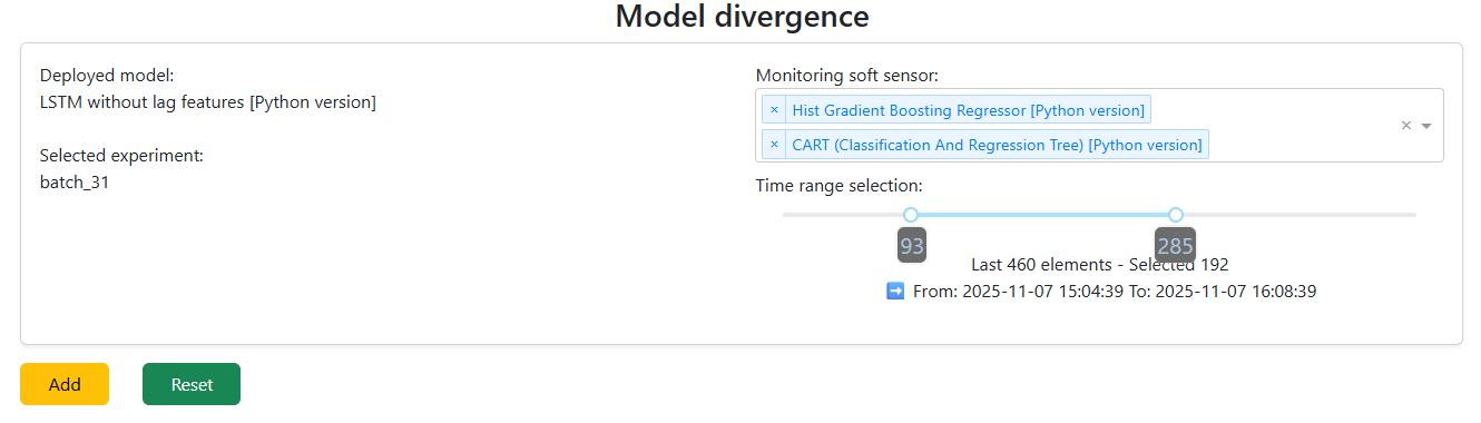
Model Divergence
Compare the deployed soft sensor — picked in the Soft Sensors section, tied to the experiment from Data Source — against alternative models from the Model Registry. Visualize how they diverge and quantify performance differences with a configurable estimator.
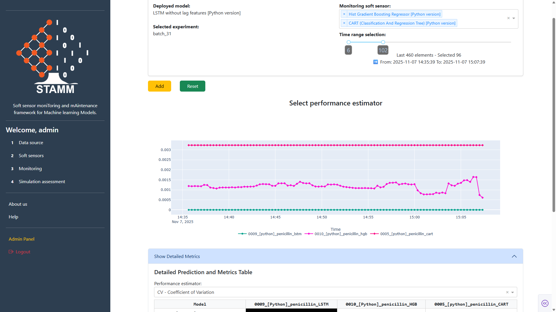
Pick the models to compare
The deployed model is loaded automatically. The dropdown lists every model in the Registry — pick one or many. The window slider scopes how much data to compare on. Click Add and the dashboard renders a performance plot for all selected models.
- Deployed model = baseline
- Pick any number of challengers from the Registry
- Tune the data window before plotting
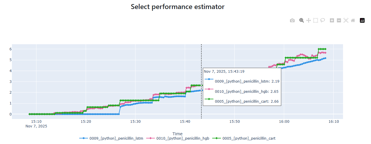
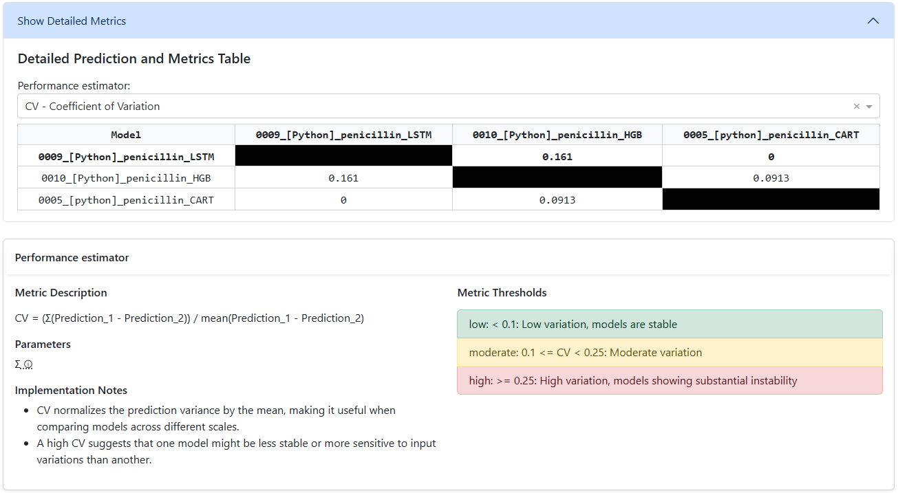
Pick a performance estimator
Add also loads an estimator picker. The estimator scores each model relative to the deployed baseline, and the results land in a side-by-side matrix table. Every estimator comes with a description, parameters, and recommended thresholds — so configuration and interpretation stay in context.
- Side-by-side matrix table of all selected models
- Estimator description + parameters + thresholds inline
- Quickly spot where challengers beat the baseline